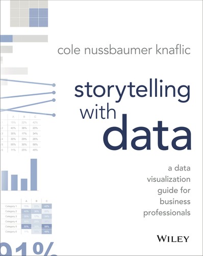
Book summary
Storytelling with Data by Cole Nussbaumer Knaflic teaches the principles of effective data visualization and communication by emphasizing that data alone is insufficient; it must be shaped into a clear narrative to influence decisions. The book outlines a structured approach including understanding context, choosing appropriate visuals, eliminating clutter, focusing attention, and thoughtfully using color and text to guide the audience. Through real-world examples and before-and-after transformations, it demonstrates how to move beyond default chart outputs from common tools to create graphs that reveal insights and drive action. Its core argument is that data visualization is a learnable skill centered on storytelling rather than mere presentation, enabling better audience comprehension and persuasion.
Key founder lessons
-
1
Understand the context
Founders must clarify who the audience is, what they need to know, and how they'll use the data before creating any chart.
-
2
Choose an effective visual
Select the right graph type that best supports the message, avoiding defaults like pie charts when bar charts convey comparisons more clearly.
-
3
Eliminate clutter
Remove unnecessary gridlines, labels, and decorations so the data stands out, allowing investors to focus on key insights instantly.
-
4
Focus attention
Use color, size, and position strategically to direct the audience's eyes to the most important data point or trend.
-
5
Tell a story
Sequence visuals and add narrative to guide the audience from problem to insight to action, turning metrics into a compelling pitch.
Grok's review
Solid toolkit, but padded and overly basic for most founders.
Cole Nussbaumer Knaflic delivers a clean, practical masterclass on turning charts into narratives that actually land—strong on visual decluttering, color discipline, and audience-focused structure, with examples that feel immediately usable in pitch decks or board meetings. What works is the no-nonsense emphasis on stripping away chartjunk so the story emerges; what doesn't is the repetitive padding that bloats a 200-page idea into 250+ and the surprisingly thin evidence base (mostly author anecdotes and a few familiar case studies rather than rigorous research). Dated in a few tool references and PowerPoint-heavy examples, it still beats most 'data viz for dummies' books by a mile. Worth a founder's time if you're early in your data-communication journey or mentoring junior analysts, but experienced operators will skim it in an afternoon and move on.
Best for: Founders weak at data storytelling or prepping investor updates
Similar books
-

The Visual Display of Quantitative Information
Edward R. Tufte
Masterclass in data visualization principles that sharpen storytelling and decision-making for founders.
-
Made to stick
Chip Heath, Dan Heath
Teaches how to craft memorable messages, boosting pitch decks, marketing, and team alignment.
-
slide:ology
Nancy Duarte
Practical guide to creating persuasive presentations that founders use to win investors and customers.
-

Big Data
Mouad Radi
Explores data-driven insights and their strategic impact on building scalable businesses.
-
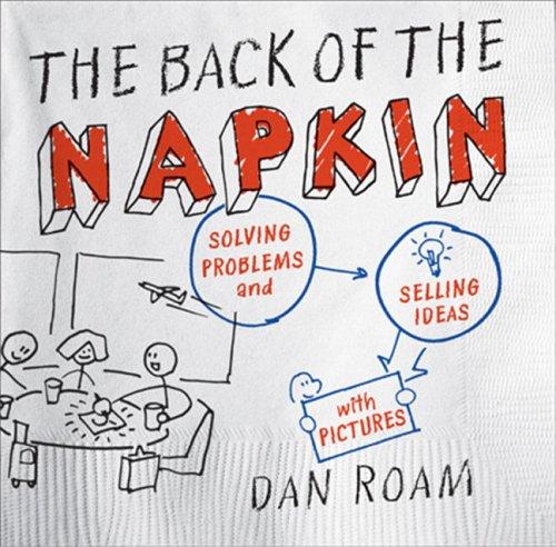
The Back of the Napkin
Dan Roam
Shows how to solve problems and sell ideas with simple drawings, aiding strategy and communication.
-

Resonate
Nancy Duarte
Reveals storytelling structures that move audiences, essential for leadership and fundraising.
Founder activity
Nobody has shelved this yet
Be the first founder to add it.